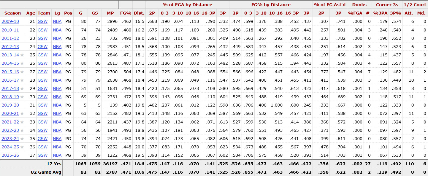
Figure 1 - Season-by-season shooting splits by distance.
Sports analytics - Basketball player shot analytics
Figure 1 - Season-by-season shooting splits by distance.
The raw data for this analysis consists of season-by-season shooting statistics for Stephen Curry across his NBA career. This dataset includes field goal attempts and percentages by shot distance, distribution of shots across distance ranges, games played, minutes, and assisted shot frequency.
Because this information is presented as a large numerical table, it is difficult for a viewer to immediately identify patterns such as shot preference, efficiency trends, or changes over time. Relationships between shot distance, volume, and efficiency are not obvious without visualization.
This is why visualization is essential. It converts dense numerical records into patterns that can be more easily interpreted and compared across seasons.
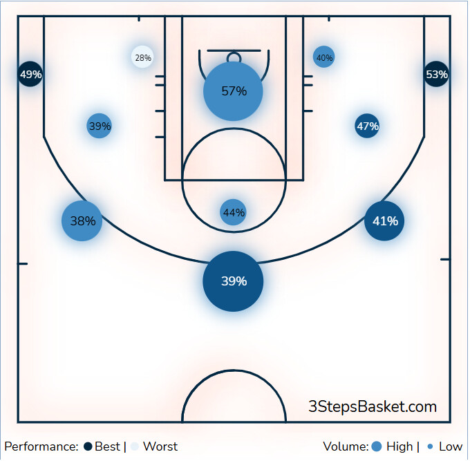
Figure 2 - Shot chart showing efficiency by court location.
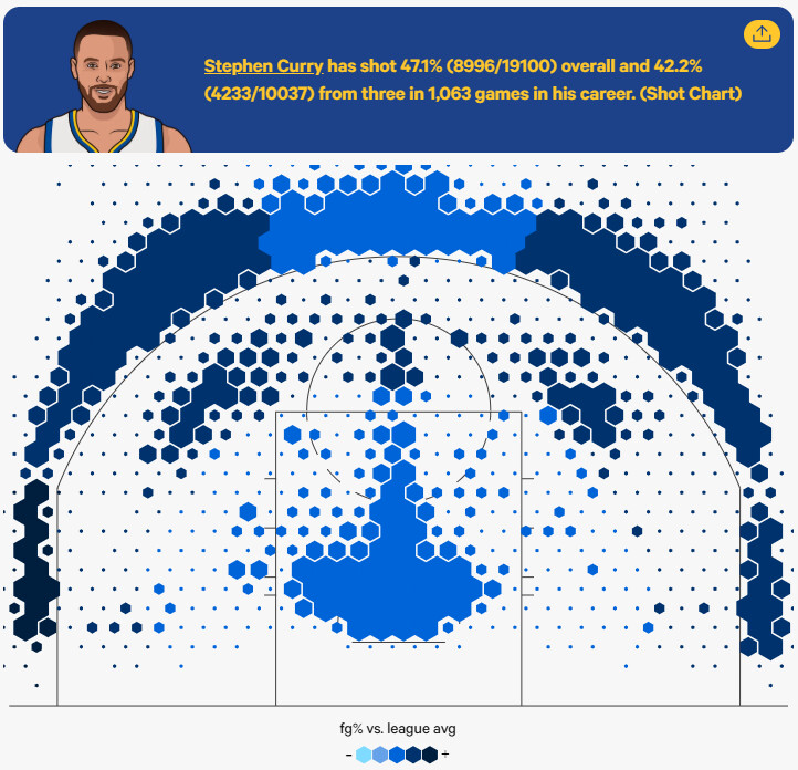
Figure 3 - Zone-based shooting efficiency and shot volume.
The raw shooting data is transformed into information through visual outputs such as shot charts and efficiency maps. These visualizations aggregate thousands of shot attempts and present them spatially and proportionally.
By mapping shot attempts to physical locations on the court, these graphics allow viewers to quickly identify high-usage and high-efficiency areas. Patterns that would require careful comparison of multiple columns of numbers become immediately visible.
In Stephen Curry's case, the visuals clearly show that long-range shots, especially three-pointers, are not only frequent, but also highly efficient compared to league averages.
The broader knowledge gained from this analysis is that shot value is not determined solely by distance, but by the combination of player skill and shot selection. Curry's ability to maintain elite efficiency from long range challenges traditional assumptions about what constitutes a good shot in basketball.
For players and coaches
For opposing teams